Art Director Holly Titchener on the design of Akoya’s fiction titles
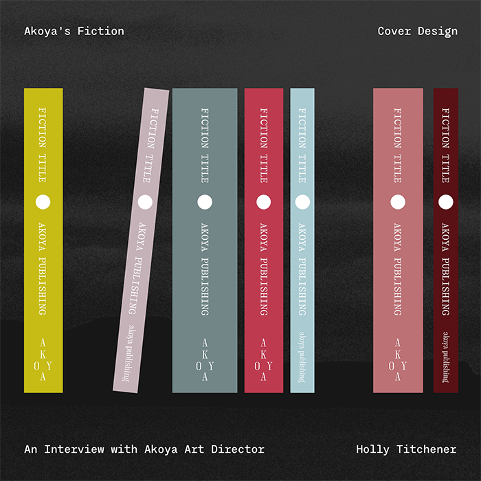
In this Q&A Akoya Art Director Holly Titchener gives us her insight into the inspiration of the cover designs for our fiction titles.
What inspiration did you draw upon when thinking about the fiction cover design?
Akoya is the Japanese term for pearls that come from the akoya-gai oyster. I wanted Akoya’s visual identity to reflect elements of the universal symbol of the pearl and circle that exists in both man-made and natural states. The circle acts as a central pull for our brand, taking inspiration from the pearl and the phases of the moon. Mirroring this, our gradient coloured pearls appear in several places across our design.
Our aim was to create a distinct style for each Akoya genre (fiction, non-fiction, poetry) that adopts a vivid, organic look and that adapts with each book, taking reference from the themes and symbols that appear throughout its pages/story.
Combining our gradient pearls with inspiration from Rothko and Joan Mitchell’s work, I started to explore the route of evoking storylines with colour. Mitchell’s vast range of colour palettes have the ability to emotionally move the viewer, some creating eerie, unsettling shadows and tones, others sparking joyful, spring-like scenes, all from her use of positioning and pigment. This approach lends itself to my desire to translate our titles through colour to the reader and signal the tone of a book through palette.
I admire cultural touchpoints that have utilised design to indicate quality to their audiences. The Criterion Collection has cultivated a strong visual system that allows cinephiles to instantaneously trust a title’s calibre or Les Editions de Minuit’s identifiable typesetting across its book covers. This inspired me to create a system that would make an Akoya title recognisable from across a bookshop.
How is colour important in the design?
The way an author uses mise-en-scene in their writing strongly impacts my visceral reaction to a book and I will always visualise the scenes in my head, like a play. I feel colour theory can connect a reader with the content and evoke subconscious emotions in their reaction to the story whether it's through an item of clothing, food, scenery or weather. Our You Glow in the Dark cover draws upon the theme of toxic waste and I wanted to lean into colours which alluded to this and spoke to the reader about the eerie and original power of Colanzi’s writing. The colour palette of My Clavicle and Other Massive Misalignments is inspired by deep red menstrual blood and the foreboding feeling hypochondria evokes, casting a black cloud over someone's mind.
The aim of the Akoya fiction design is to create a relationship with the reader, whether it's pulling the book off the shelf because they’re drawn to the cover, or after they’ve put down the book and realise why the cover has used those particular colours and feel like they’re involved in the reference.
What was the inspiration behind the typeface you chose to use?
As we are an independent publisher, it was really important to me to find a typeface that was created by a small foundry. Velvetyne are a small French-based type foundry that really push the boundaries of type, Avara (designed by Raphaël Bastide) is a unique, beautiful type family that combines an elegant approach with a modern, square-grid inspired shape.
My aim was to choose a typeface that felt striking but classic in its roots, like Akoya. I wanted the design to always be rooted in a timeless style, but with innovative ideas/aesthetic pushing it forward.
How much testing did you do before getting to the finished design?
Colour and CMYK printing is a huge love-hate relationship for a designer and getting the perfect print can require a tremendous amount of work. We printed the colours in several hues before finding the right ones.
What do you hope readers will feel when they encounter an Akoya fiction cover?
I hope they feel assured and excited when seeing our covers in the bookshop. By building our brand we hope the covers will become synonymous with the high quality literature we publish. We hope that they will equate the design with titles that will take them on a journey of discovery, enabling them to view the world from a new perspective and gain a sense of wonder that they didn’t have before.
